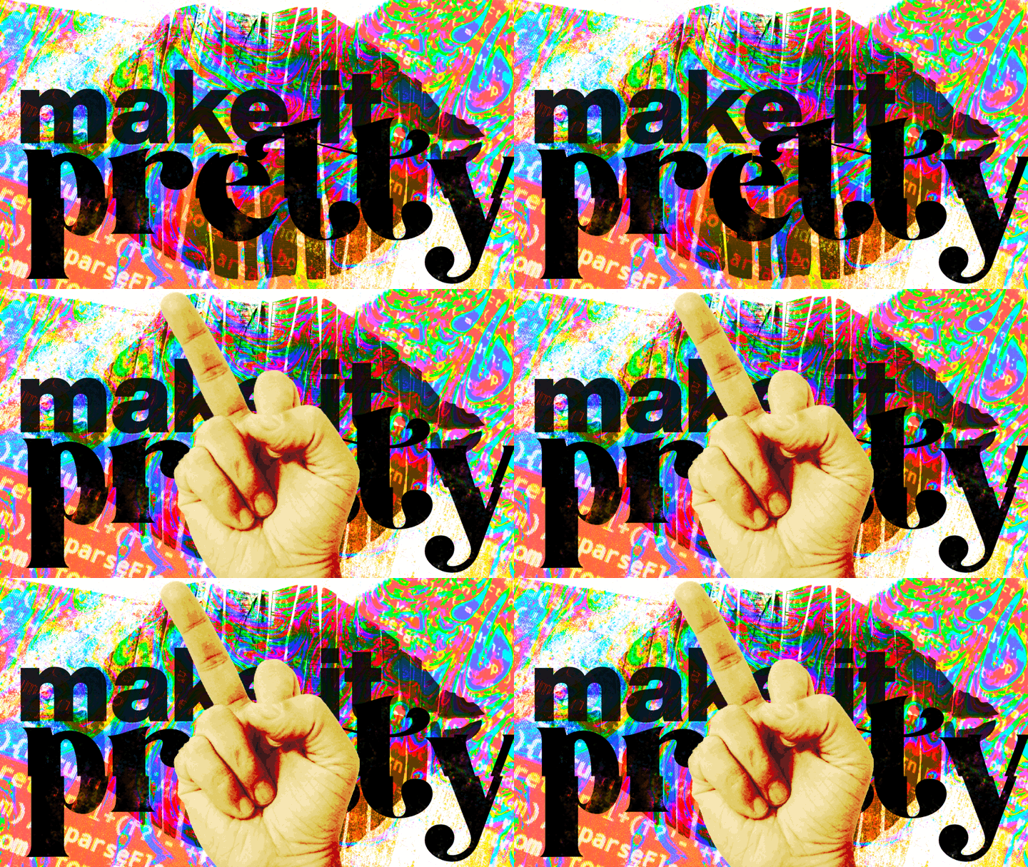
“Make it pretty.”
If you’ve been a UX designer for long, I’m sure you’ve received these instructions. Let me tell you why I hate that phrase:
The role of design isn’t to make an experience “pretty” - it’s to make it intuitive, learnable and useful. Pretty is just a side effect.
Many times, this phrase is used dismissively: “I’ll make it work right and do all the important stuff. You just make it look pretty. I’m no good at that”. It’s a pat on the head. A suggestion that the design of a thing can be tacked on at the end. Put a nice coat of paint on it. Good design is so much more than that!
But here’s the other thing - great experiences are also aesthetically pleasing. To dismiss that is to exhibit a lack of understanding of human psychology. Launching ugly but functional products is a race to the bottom. Part of engagement is attraction. Creating attractive experiences requires a complex understanding of Gestalt principles, color theory, accessibility, etc. Boiling that down to “make it pretty” is also insulting in its own special way.
So, I made this animated GIF just in case you ever forget how to properly respond the next time you’re told “make it pretty”. ; )
“Make it Pretty”

